Sticky Diagram Explainer — Framework Assembles On Scroll
A scroll-paced framework explainer where a pinned diagram on the left assembles part by part as teaching cards crossfade past on the right — pilots a 4-part offer architecture but the pattern fits any 3–5 part named methodology, model, or system.
Best for: Course creators teaching a 3–5 part framework or named methodology who want learners to watch the whole model assemble while reading each part — pure scroll, no clicks.
Live preview — scroll inside the frame to see the full page.
What it does
- Pinned diagram — a stylized blueprint or framework diagram pins on the left while the right side scrolls past it
- Part-by-part build — each piece of the diagram lights up in lockstep with its matching teaching card entering view
- Smooth card crossfades — teaching cards fade through several states for buttery transitions, even on slower hardware
- Auto-updating progress label — a 'Part N of 4' header keeps the learner oriented as they move through the framework
- Mobile-friendly fallback — collapses gracefully to a single column with the diagram inline so no one is stuck with a broken pin
- Synthesis closer — ends with a synthesis section and a reflection prompt to lock the model in
Best use cases
- Branded methodology lessons — the '4 Pillars,' the 'ABC Method,' a signature 5-step process
- Process and workflow teaching — phases of a launch, stages of a sale, steps of a craft
- Acronym frameworks — anywhere every letter needs equal weight (RACI, SMART, AIDA)
- Stack and architecture lessons — parts of an email, layers of a UX design, elements of a song
- High-trust professional curricula — coaching certifications, consulting frameworks, leadership programs
- Strategy and positioning courses — brand pillars, positioning models, GTM playbooks
What you can change with your DNA
When you run this through the remix skill, your CCOS DNA — brand, voice, audience — drives these decisions automatically:
- Colors — a single accent color drives the highlights, with a 4-color base palette for background, surface, text, and ink. Pick an editorial warm or premium cool to match your brand register
- Fonts — two roles: a display serif for headlines and a clean UI sans for body. Editorial serif pairings keep the magazine feel; geometric sans pairings move it toward a design-studio feel
- Copy — lesson opener (headline, lede, meta), four teaching cards (number, name, headline, two paragraphs, optional pull quote), synthesis section, reflection prompt
- Images — the pinned diagram is the most flexible slot: blueprint, course-video stills that swap per state, build-up illustration, or any image that mutates with the framework
- Behavior — scroll thresholds and crossfade timing are tunable, so you can tighten the pace for skimmers or loosen it for slow readers
How remixing works
From "swiped it" to "shipped it" in three steps.
Pick a remix
Browse the library, find one that fits — like this one.
Run it through your DNA
The remix skill uses your CCOS DNA to swap colors, fonts, copy, and structure so it lands as yours.
Ship it
Paste the finished HTML into Thinkific, Kajabi, WordPress, or any platform that takes embed code.
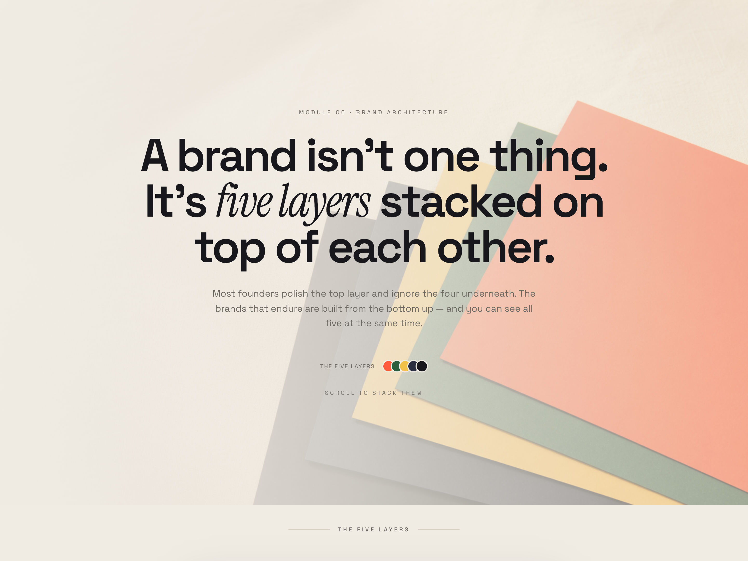
Sticky Card Stack — Layered Concept Lesson
A scroll-driven stack where vivid color cards literally pancake on top of each other as the learner moves down the page — pilots a 5-layer brand storytelling framework but the pattern fits any lesson teaching layered or hierarchical structures.
 Featured
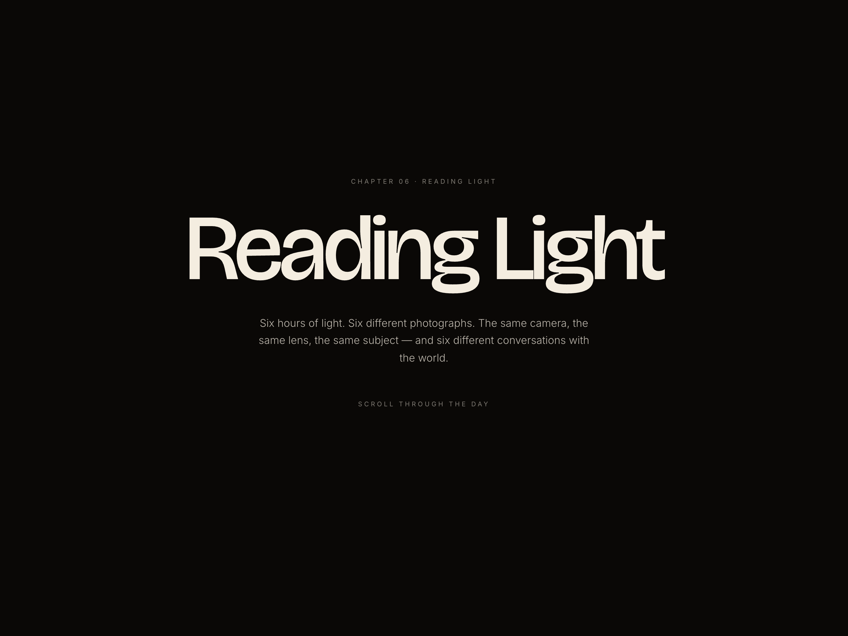
 Chapter Color-Shift Essay — Mood-Driven Long-Form Lesson
A long-form magazine-style lesson where the entire page palette transitions chapter by chapter to embody the topic — pilots six chapters of natural light but the pattern fits any 3–7 part lesson covering distinct conditions, moods, or states.
Create a new list
Save your favorites
Email me a magic link and I'll add this to your favorites list.